How Data Visualization Can Optimize Enterprise Mobile Analytics

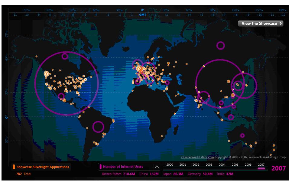
Mobile devices access a massive 1.5 exabytes (that’s 1.5 billion gigabytes) of data every single month. Businesses know that capturing and using this information through enterprise mobile app platforms is critical to organizational success. However, visually interpreting that data to better understand it can be difficult. Thankfully, new data visualization tools are emerging to help make this information easier to understand for both enterprise mobile users and developers. While static mobile reporting is common today, real-time data visualization of enterprise mobile analytics is a newer capability. Data visualization is different than reporting because it enables users to interact with visual representations of live data, rather than simply viewing a snapshot in time.

For example, with KidoZen’s drag-and-drop interface, users can explore different visualizations of current data in more than 20 formats, from clustering bubbles and scatterplots to circular dendrograms. Preferred visualizations can be cataloged for future use, as well as embedded across multiple applications by entering a single line of code. Finally, management capabilities enable controls on who can see, edit and manage data visualizations.
If you are already employing enterprise mobile analytics, why not optimize that investment by utilizing powerful data visualization tools?
