In the world of marketing and advertising, logos are likely the first introduction most consumers will have to a given business. The most important detail about any logo—whether it’s that of a multibillion dollar corporation like McDonald’s or a small start-up with an employee roster of one—is that the logo design is memorable. The best logos make a simple statement and evolve over time. Let’s take a look at some good examples of quality logo design on the part of well-known companies that have been wise enough to allow their insignias to grow and change along with their businesses.

Apple
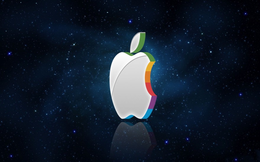
Steve Jobs and co. is perhaps the best example we have of a logo that has changed radically since the company’s inception in 1976. The first Apple logo was an image of Newton underneath the tree where he so famously “discovered” gravity when he was hit in the head by a falling apple. The following year, the tech company’s logo was changed to a far simpler image of an apple in bright, multicolored stripes with a bite taken out of it and the word “apple” alongside it. Seven years later the text was removed altogether, and ever since the Apple logo has been some variation on the plain image of the apple itself.
The evolution of the Apple logo is one all business owners can learn from. The decision to gradually simplify the image by making small tweaks here and there over time is a great example of how a company logo can come to signify the business in a clear statement to consumers—even if the company’s name is nowhere to be found on the image.
Nike
As with Apple, Nike’s logo initially included the company name and later phased out the letters to focus exclusively on the image. The Swoosh, designed in 1971 by Carolyn Davidson, has gone through several evolutions to eventually become the shape we’re familiar with today. The Nike logo hits all the characteristics of a great design: it’s simplistic and uniquely recognizable; its active shape implies motion and speaks to the spirit of the Nike brand; and it has withstood the test of time.
Target
The mass retail chain’s logo is almost universally recognizable: Studies show that over 90 percent of Americans can identify Target’s round red-and-white logo on sight. This is another example of the company name—which originally appeared on top of the bull’s-eye—being removed from the core image; however, many of the company’s store signs still include the Target name underneath the logo itself. The Target logo is another example of a strong image that resonates with customers, and its design makes great use of color psychology to evoke a particular feeling.
Each of the above three companies have strong logos that are instantly recognizable by a broad customer base. The lesson to take away from each of these examples is that logos can improve for the better over time without losing their initial message, whatever that may be. Keep these ideals in mind as you work to create your own company’s logo and you’ll surely be steered in the right direction.