Excel At Making A Gripping Presentation

As a part of the developmental process being carried out in schools and colleges, not only are the students required to demonstrate good writing skills, but are also checked for their public speaking ability in the form of numerous presentations they have to give on a number of different subjects. To aid in this task, students firstly require developing good verbal communication and speaking skills and secondly need to focus on their technical skills with regard to the visual presentations they need to prepare to go along with their verbal presentation. Most teachers require students to prepare a certain topic, case study, etc. and need to present it verbally and prepare slides on the PowerPoint also. If you happen to have a presentation sometime soon and have the content ready with you, all it takes is a few simple steps to make the slides. The following guideline highlights the main points that need to be considered when developing a presentation using PowerPoint.
The rule of thumb should be to make the PowerPoint presentation as simple as possible. Avoid cluttering slides and making use of too loud a background that the audience loses their focus. After all, the main purpose of the presentation is not to attract the listeners to the slides only but they should remain focused on the message you are trying to pass on. On the contrary, if too much artwork is done on the slides, chances are your audience will not only sneer at the presentation but also fail to hear you out and evaluate you properly. Hence, keep it simple so that it stays attractive to the audience viewing your presentation.
Adding too much text and a lot of bullet points is a definite No-No. You do not want the entire message to be pasted on the slides, but only the main points which you can easily elaborate in your verbal presentation. Hence, put down as little text as possible and keep the slides clean and less crowded. This way the attention and minds of the audience would be entirely on the slides, and would enable you to enjoy giving your presentation more.
Too many animations can also distract the audience. Making use of animations on all the slides is not a good idea and their use should be limited to just those points or slides that highlight a very important or crucial point and not otherwise. The overall presentation must give a formal and professional feeling, instead of appearing like a game show. So, do not ever go overboard in this particular area.
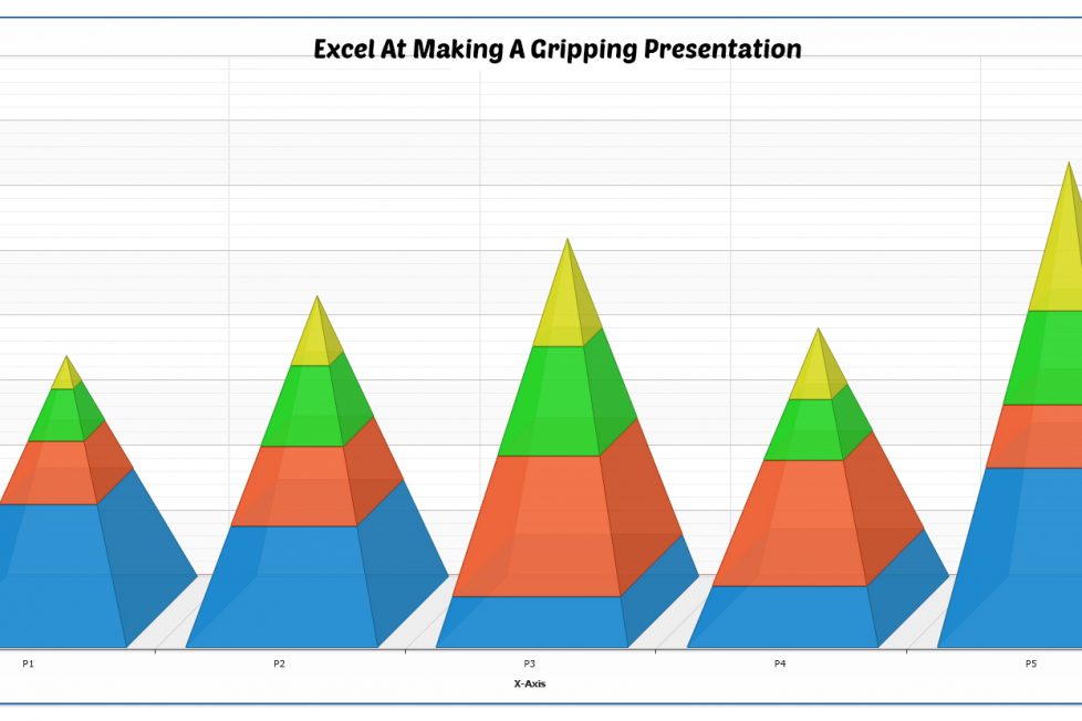
PowerPoint has a very easy way of creating charts and a lot of data can be easily displayed by making good use of this functionality. Hence, in order to pass on your message in a more focused and easy manner, charts can certainly be made use of. It becomes easier for the audience to know the structure of your presentation, which is a plus when you need to put your point across to them.
Even if this tip might not seem worth considering in the beginning, but the choice of font largely affects the success of the presentation. When the slides are being made, the fonts may seem neat and legible at a few inches from the computer screen. But when it is shown on an overhead projector, it is a real struggle for the students, who are sitting too far at the back of the room or hall. Therefore, try to adjust the font style and size as per the size of the room and the audience so that they can easily read what is there on the slides when you start with your presentation.
Author Bio:
Jacqueline Smith is the writer of this guest post. She is a counselor for students in the US, who are habitual of asking online- Can you write my essay for me? Her advice can be easily sought by all at GetHomeworkOnline.com, where students can learn the tips to write better essays.
